iOS Widgets: Bringing Real-Time Vehicle Range Insights to the Lock Screen
February 2023 - May 2023 / 4 min read


Overview
This project set out to transform the iOS lock screen into a powerful, at-a-glance dashboard for a leading automotive brand’s flagship app. Our mission? To deliver instant, essential updates on vehicle status—like remaining range, charging progress for electric models, and quick access to launch the app—all without needing to unlock the device. Designed with the unique needs of each vehicle type—ICE, BEV, and PHEV—in mind, these lock-screen widgets provide a seamless, informative experience tailored to make every driver’s journey easier and more connected.
Activities
Requirement Gathering, Information Architecture, UX Concept, Concept Validation, Handoff and Collaboration
Organization
Unfortunately, in adherence to a non-disclosure agreement, certain design elements have been omitted and any details that could disclose the client's identity have been censored or redacted. The primary objective of this document is to highlight the skills, methodologies, and results attained through the project.
Research
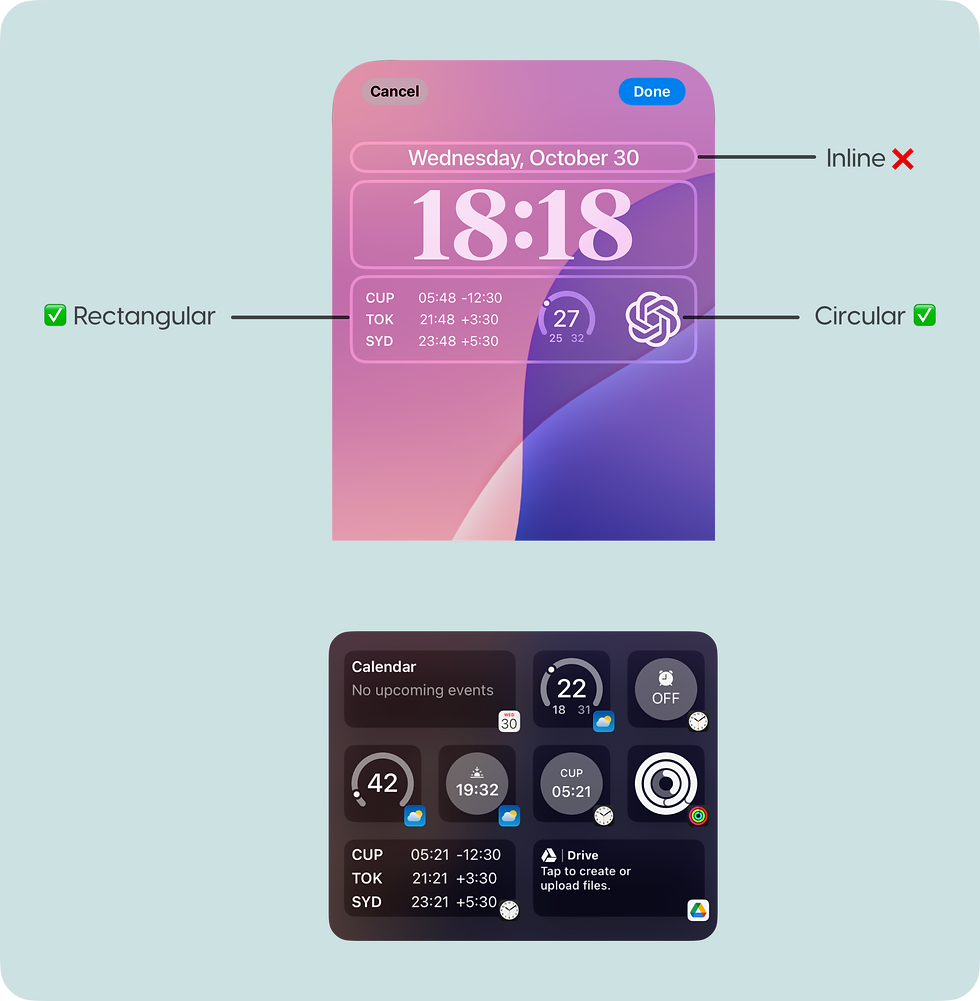
I began with a deep dive into available iOS widget types to understand which would best serve our needs. Apple currently has the following lock-screen widget styles:
-
Rectangular: Ideal for displaying multiline text or small graphs, allowing flexibility in content.
-
Circular: Effective for progress views and gauges, these widgets convey information in a compact, visual format.
-
Inline: Primarily text-based, useful for longer content requiring concise display.
The Rectangular and Circular ones ended up being most appropriate for our use case.


Information Architecture & UX Concepts

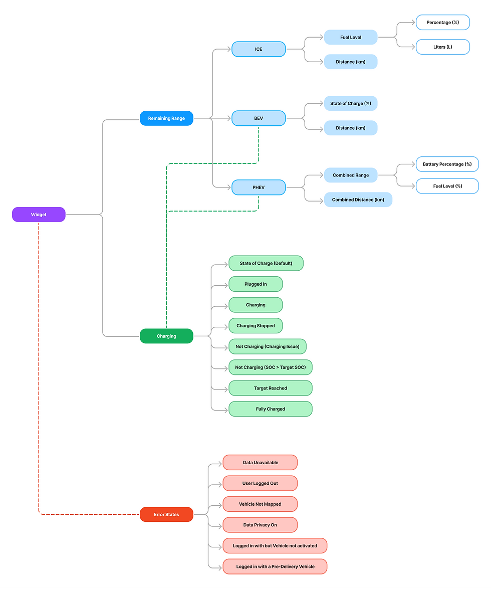
To ensure reliability, I made sure to outline error scenarios for different instances like data unavailability, vehicle unmapping, or data privacy settings. Each state was mapped to every widget variation to ensure edge cases were covered and that users always received clear, actionable information.


For electric vehicles, various charging states were identified, including charging, charging stopped, target charge reached, and fully charged.


I then created an overview table of initial UX concepts:

Collaborating closely with the Product Owner and UX Lead, I gathered the requirements and developed an information architecture. The key information for each type of vehicle was as follows:
-
ICE: Fuel level (in % and liters) and distance.
-
BEV: State of Charge(%) and distance.
-
PHEV: Combined range indicating the percentage of battery and fuel level, as well as the total distance.
Handoff and Release


After all concepts were validated with the Proof of Concept and Proof of Technology teams, the designs were handed off to the UI team. I collaborated with the UI and engineering teams to ensure a smooth transition into production, successfully delivering this feature to production.
These were the final designs: